library(SeroTrackR)
library(tidyverse)

your_raw_data <- c(
  system.file("extdata", "example_MAGPIX_plate1.csv", package = "SeroTrackR"),
  system.file("extdata", "example_MAGPIX_plate2.csv", package = "SeroTrackR"),
  system.file("extdata", "example_MAGPIX_plate3.csv", package = "SeroTrackR")
)
your_plate_layout <- system.file("extdata", "example_platelayout_1.xlsx", package = "SeroTrackR")

sero_data <- readSeroData(
  raw_data = your_raw_data,
  platform = "magpix",        # default
  version = "4.2"             # default
)

plate_list <- readPlateLayout(
  plate_layout = your_plate_layout,
  sero_data  = sero_data
)

qc_results  <- runQC(
  sero_data = sero_data,       # load in your serological data variable
  plate_list = plate_list      # load your plate list variable
)

mfi_to_rau_output <- MFItoRAU(
  sero_data = sero_data,
  plate_list = plate_list,
  qc_results = qc_results,
  std_point = 10
)6 MFI and RAU plots
6.1 Visualising MFI and RAU Data
This tutorial focuses on creating boxplots to visualise the Median Fluorescent Intensity (MFI) or converted Relative Antibody Units (RAU) for each of the antigens in the panel.
The box plots per antigen visualise the min, median, max MFI and IQR values.
The grey boxplots in the background indicate the MFI values for the dataset used to train the PvSeroApp model.
6.1.1 Setup
6.1.2 MFI
We can use the plotMFI function inside the SeroTrackR R package to conveniently plot the MFI data from our experiment as well as the grey background boxplots of the WEHI dataset used to train the PvSeroApp model.
plotMFI(mfi_to_rau_output, location = "PNG")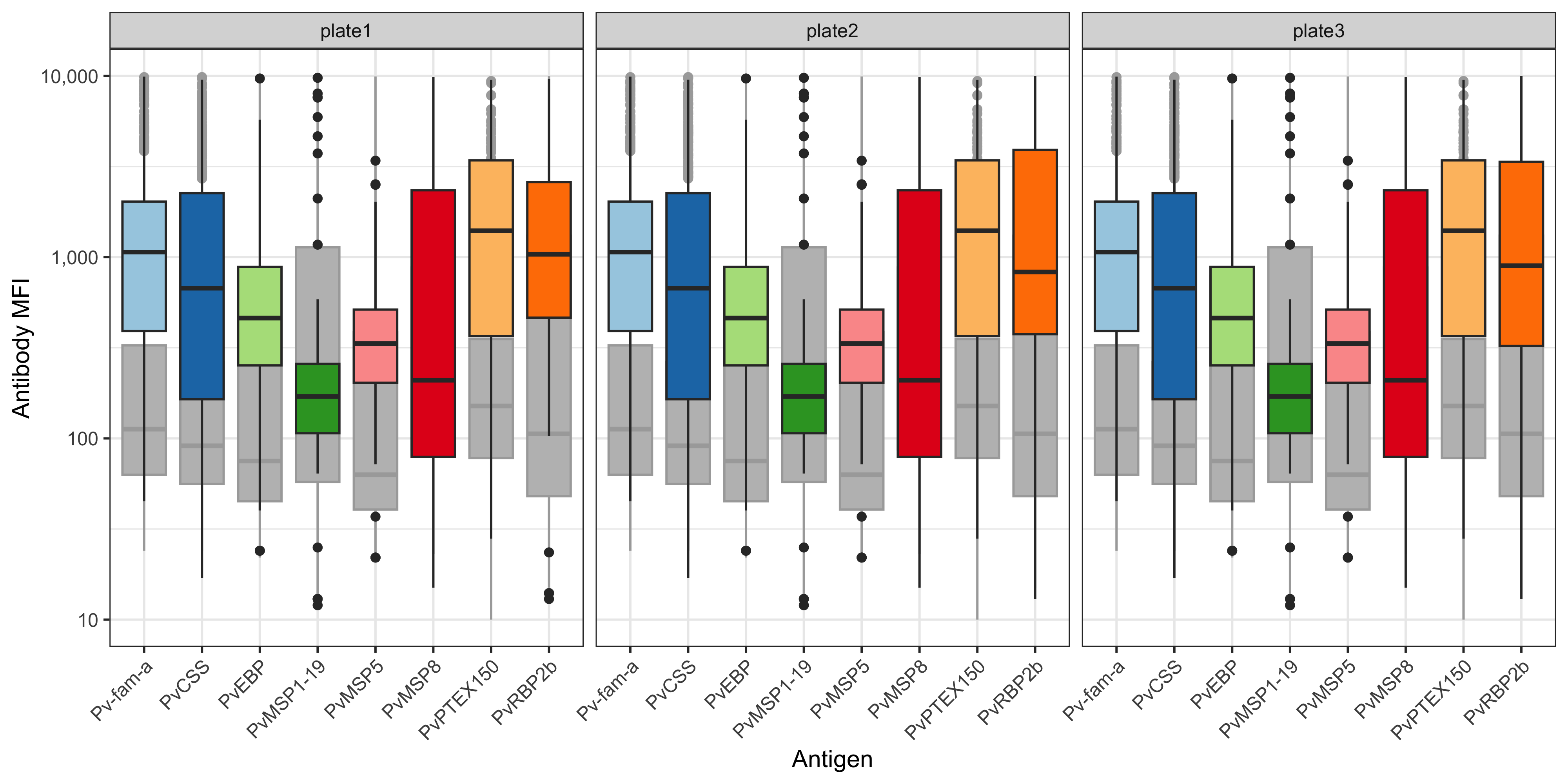
You can also plot this using ggplot2 and customise:
df_results <- mfi_to_rau_output[[2]]

# relabel antigen names from lab codes to proper antigen names
old_names <- c("EBP", "LF005", "LF010", "LF016", "MSP8", "RBP2b.P87", "PTEX150", "PvCSS")
new_names <- c("PvEBP", "Pv-fam-a", "PvMSP5", "PvMSP1-19",  "PvMSP8", "PvRBP2b", "PvPTEX150", "PvCSS")

name_lookup <- setNames(new_names, old_names)

df_results <- df_results %>%
  select(SampleID, Plate, ends_with("_MFI")) %>%
  rename_with(~str_replace(., "_MFI", ""), ends_with("_MFI")) %>%
  pivot_longer(-c(SampleID, Plate), names_to = "Antigen", values_to = "MFI") %>%
  mutate(
    Plate = factor(Plate, levels = unique(Plate[order(as.numeric(str_extract(Plate, "\\d+")))])), # Reorder by plate number
    MFI = as.numeric(MFI)
  )

df_results %>%
  ggplot(aes(x= Antigen, y = MFI)) +
  geom_boxplot(aes(fill = Antigen)) +
  scale_y_log10(breaks = c(10, 100, 1000, 10000), limits = c(10, 10000), labels = c("10", "100", "1,000", "10,000")) +
  scale_fill_brewer(palette = "Paired", type = "qual") +
  labs(x = "Antigen", y = "Antibody MFI") +
  facet_wrap( ~ Plate) +
  theme_bw() +
  theme(axis.text.x = element_text(angle = 45, hjust = 1), legend.position = "none")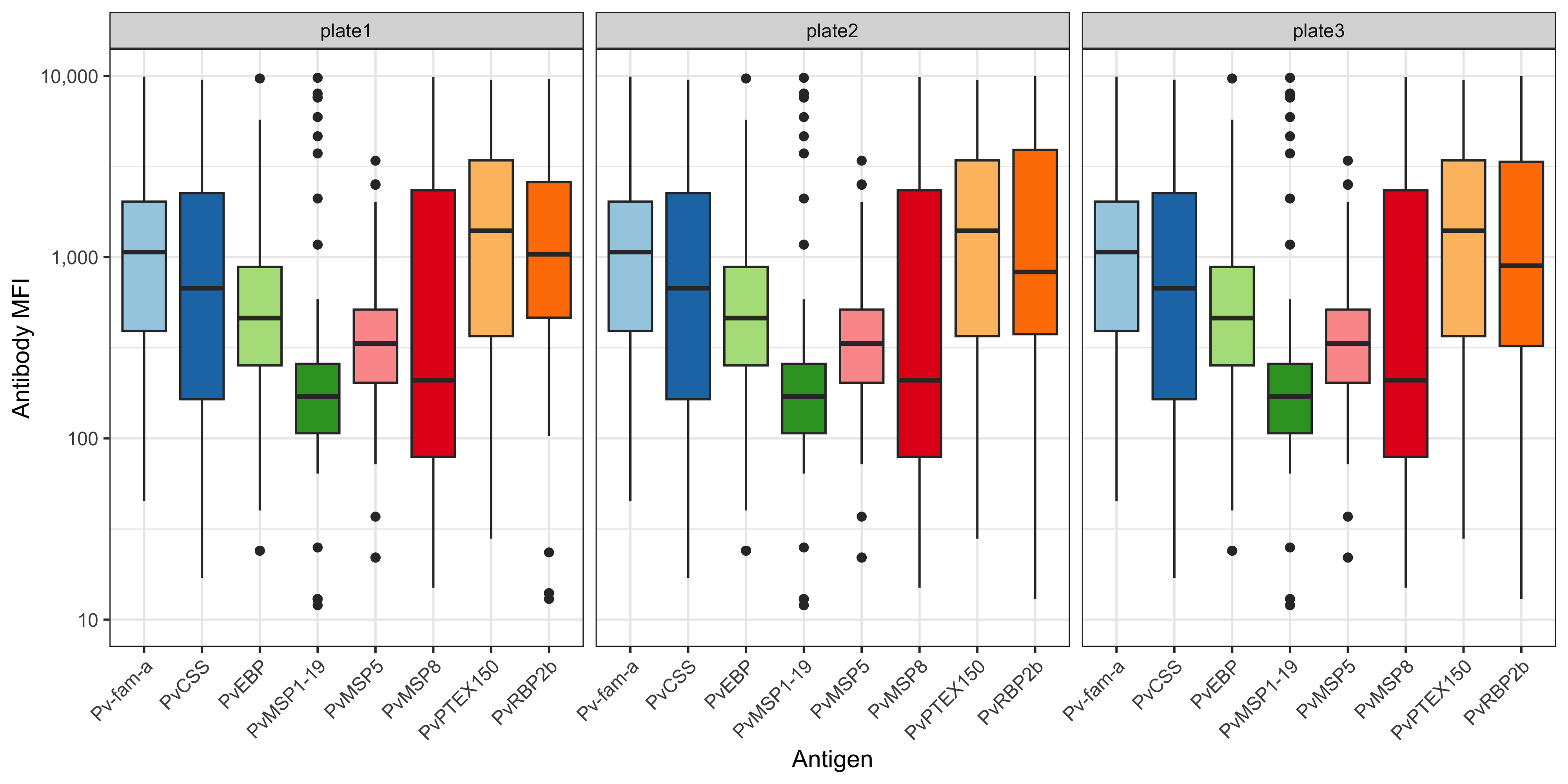
6.1.3 RAU
A similar function and code pipeline can be used for RAU.
We can use the plotRAU function inside the SeroTrackR R package to conveniently plot the RAU data from our experiment as well as the grey background boxplots of the WEHI dataset used to train the PvSeroApp model.
plotRAU(mfi_to_rau_output, location = "PNG")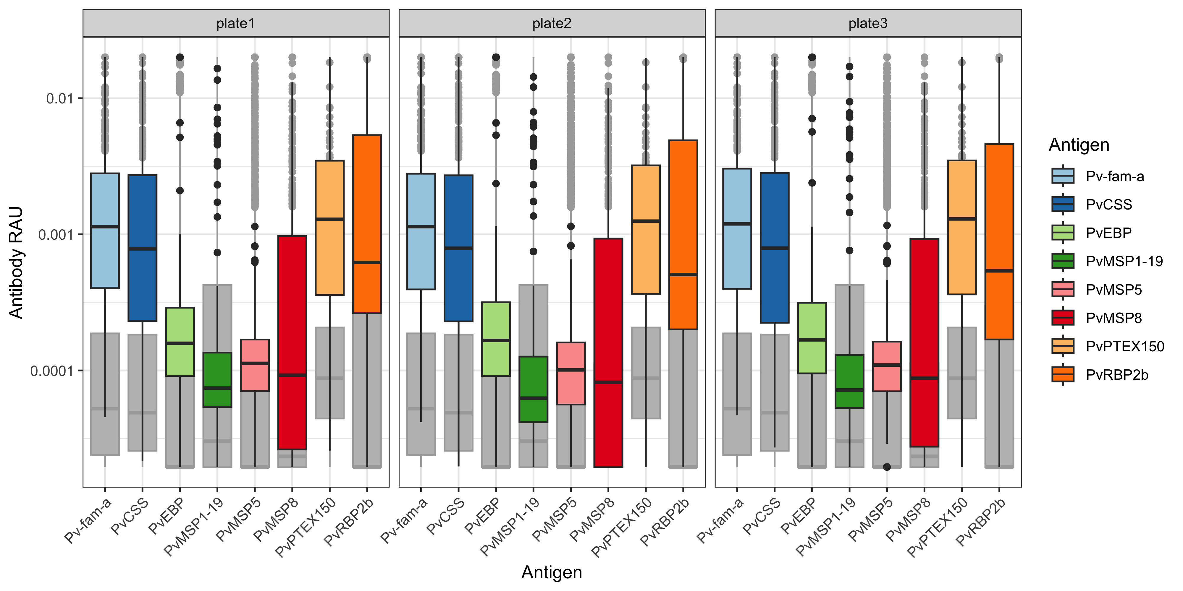
You can also plot this using ggplot2 and customise:
df_results <- mfi_to_rau_output[[2]]

# relabel antigen names from lab codes to proper antigen names
old_names <- c("EBP", "LF005", "LF010", "LF016", "MSP8", "RBP2b.P87", "PTEX150", "PvCSS")
new_names <- c("PvEBP", "Pv-fam-a", "PvMSP5", "PvMSP1-19",  "PvMSP8", "PvRBP2b", "PvPTEX150", "PvCSS")

name_lookup <- setNames(new_names, old_names)

df_results <- df_results %>%
  select(SampleID, Plate, ends_with("_Dilution")) %>%
  rename_with(~str_replace(., "_Dilution", ""), ends_with("_Dilution")) %>%
  pivot_longer(-c(SampleID, Plate), names_to = "Antigen", values_to = "RAU") %>%
  mutate(
    Plate = factor(Plate, levels = unique(Plate[order(as.numeric(str_extract(Plate, "\\d+")))])), # Reorder by plate number
    RAU = as.numeric(RAU)
  )

df_results %>%
  ggplot(aes(x= Antigen, y = RAU, fill = Antigen)) +
  geom_boxplot() +
  scale_y_log10(
    breaks = c(1e-5, 1e-4, 1e-3, 1e-2, 0.03),
    labels = c("0.00001", "0.0001", "0.001", "0.01", "0.03")
  ) +
  scale_fill_brewer(palette = "Paired", type = "qual") +
  labs(x = "Antigen", y = "Antibody RAU") +
  facet_wrap( ~ Plate) +
  theme_bw() +
  theme(axis.text.x = element_text(angle = 45, hjust = 1))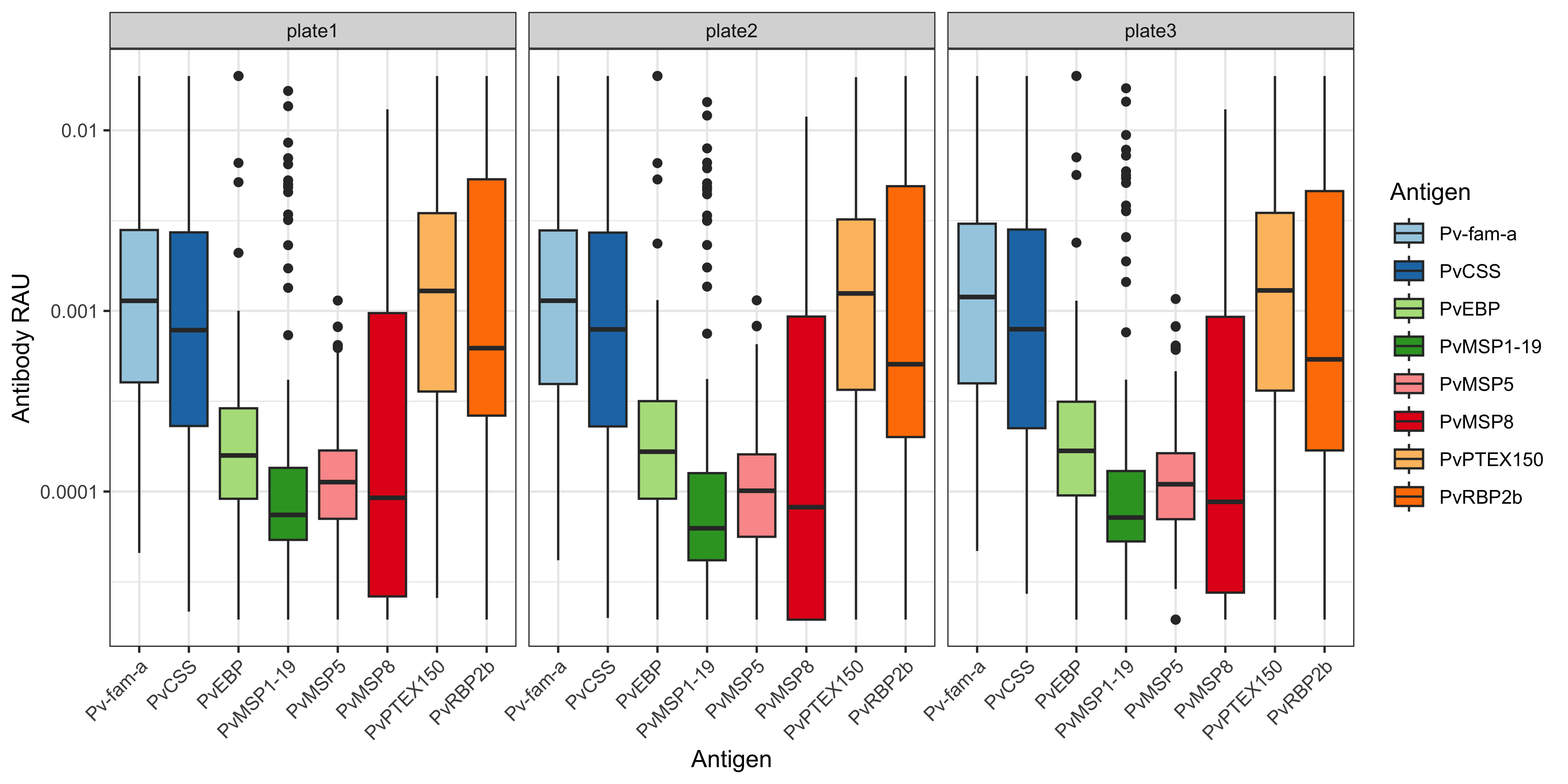
6.2 Customisations
For more customisations on how to manipulate your ggplot2 see the manual here or the book (Wickham 2016).